Design Professionals Reflect on Unexpected Choices
September 30, 2024
“If [a design] doesn’t look authentic, you’re out,” said Yang Kim, co-founder of People Design (formerly BBK Studio), referring to a photo of office furniture taken in a field. “They didn’t do it just to be different. They were looking to differentiate the company’s brand and make an image that stays with people.”

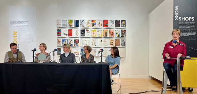
Kim was one of five members of a panel for a September 8 discussion hosted by West Michigan Graphic Design Archives (WMGDA), and facilitated by Sharon Oleniczak, a WMGDA board member. The members of the panel represented various aspects of the graphic design discipline, and each had a role in at least one of the projects included in the exhibit “Unexpected Choices,” currently at the Lowell Arts Gallery. More than 30 people came to hear—and contribute to—the discussion, which ranged from the benefit of collaboration to the importance of preserving history. People shared stories, reminisced and offered insights. Here are a few highlights.
Barbara Loveland, designer, professor, and co-founder of West Michigan Design Archives, decides how to “tell the story” of a piece graphically by thinking about the audience. When reintroducing classic furniture designs when she worked at Herman Miller, she considered that architectural designers had already seen the furniture designs photographed from every angle. To make sure that audience would experience it in a fresh way, she shipped a different product to a few of her favorite illustrators so they could live with it while creating their interpretation of it. She gave the illustrators near total freedom, although she did review preliminary sketches. “It was a good thing, because one came back as a nude and back then they just didn’t do that at Herman Miller,” she said with a laugh. The result was a catalog that made an impression, even though the furniture wasn’t new.
Leslie Black, who has worked at or led several agencies in the Grand Rapids area, including Leslie Black Design, used her work with AutoCam as an example of collaboration. She started working with the client in their start-up phase, and from the beginning, she had the advantage of regular access to the CEO and CFO. Working alongside a writer, she helped articulate the company’s values and then convey them through graphic expression. Precision and technical expertise in manufacturing were important, which the design team showed through dramatic photography, some of which had a touch of humor. “The photo of an apple [set atop a man’s head] showed that leadership was gutsy enough to take an arrow,” Black said. That client-designer relationship lasted more than 25 years.
Chuck Oleniczak, who retired from Central Michigan Paper Company as Specification Sales Manager, talked about working with some of the best companies around, and the challenges that came with meeting their high expectations. For one Herman Miller annual report, he recalled, Steve Frykholm, Herman Miller’s first in-house graphic design lead, decided he wanted a photo of each employee on a postage stamp. Not only that, but he wanted those stamps to be produced the same way the federal government did it—and he said he needed to have all that figured out in the next day and a half. “And this was in the days before the internet and Google,” Chuck said. In the end, it all worked out—after they realized they’d need to ship the printed stamps in a refrigerated truck to keep them from sticking together, because it was summer.
Yolanda Gonzalez, an illustrator and partner in the Grand Rapids-based design firm Mr. & Mrs., said one of her challenges was in keeping the design fresh every year: “In opera, the stories are repetitive. You’ve got love and murder,” so each season she needed to offer a different take on those themes. For inspiration for her illustrations, she turns to the music itself. “I like to listen to the music. You get the emotion and then create iconic bits that represent the story.”
Yang Kim, co-founder of People Design (formerly BBK Studio) said the most important thing a designer needs to know before beginning a project is the “why.” “Knowing that leads to the answers to questions about graphic expression,” she said. She recalled one client who came to them asking for posters for the factory. When she asked why, “they had no answer, so the most we could do at that point was decorate.” She said the biggest change to design is yet to come—AI.
What did members of the panel hope young designers can gain from the archives? Inspiration, they said, and being able to see how previous designers came up with ideas, as well as a dose of nostalgia and the chance to lay hands on physical artifacts, and to see the care and thoughtfulness that went into the choices they made.
“This exhibit is about unexpected choices,” said Alison Popp, associate professor of design at Ferris State University, who attended the event. “Today, [students] want to use a template or something the previous class did. The archives shows things that are clever and different.”
The exhibit is open to the public and runs through October 4.

